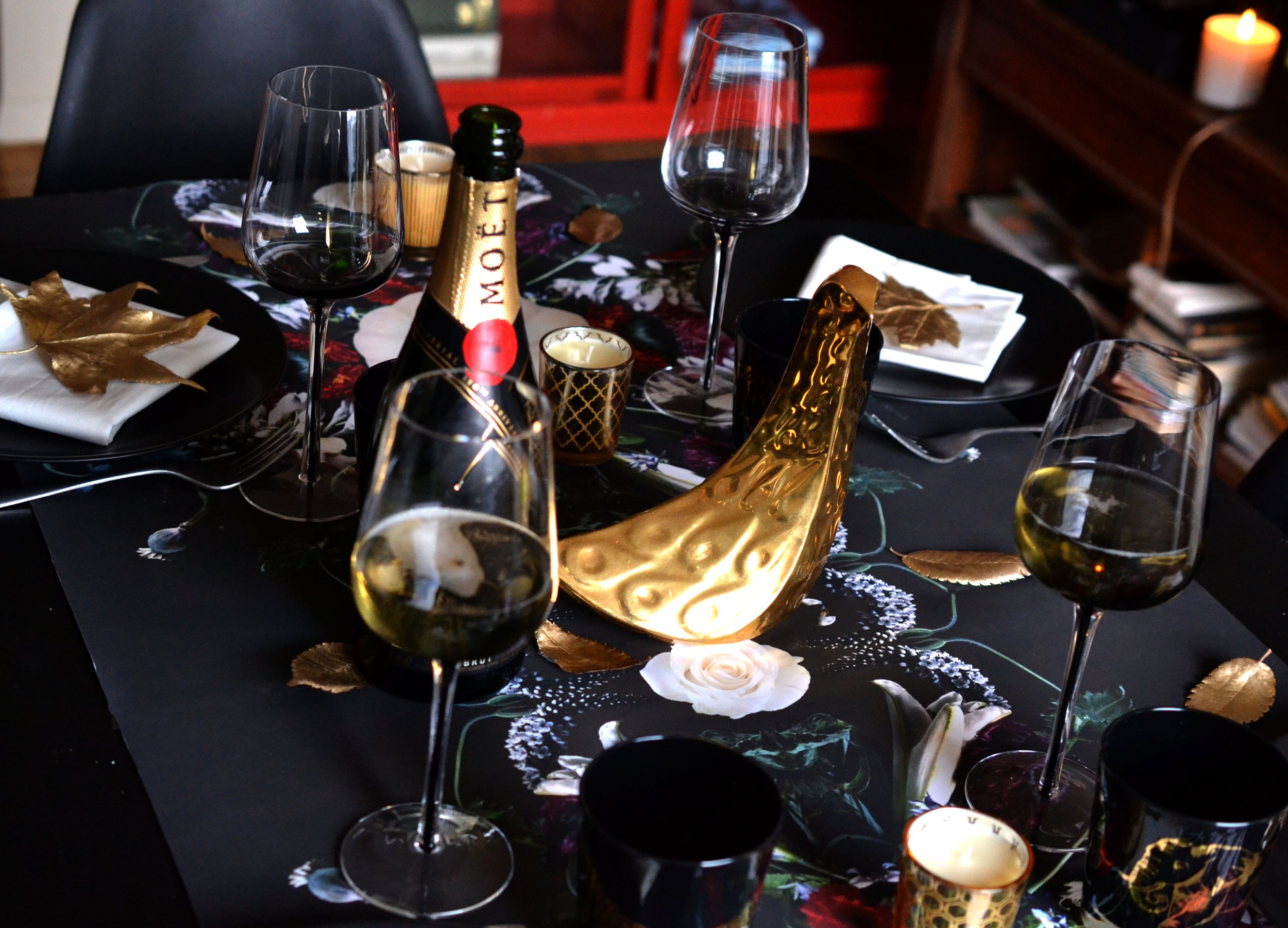
With the holiday season approaching, one of my favorite creative outlets is designing unique table settings that bring warmth and elegance to gatherings. Since moving to the USA, I’ve absolutely embraced Thanksgiving, adapting it into my personal tradition. Perhaps it’s time to step away from the classic autumn palette of pumpkin oranges and earthy tones and reimagine Thanksgiving through a fresh, modern lens. My vision centered around the bold contrast of matte black and gold sophisticated, eye-catching, and somewhat unconventional for the holiday.
I like to design with pieces I already have, allowing them to inspire the overall look. My starting point was a gold bird ornament from Jonathan Adler, paired with animal-print glasses that added a playful yet refined touch. I selected a different animal print for each glass, choosing patterns that reflected each friend's unique personality, so they’d have a fun, personalized way to find their seat at the table.
To make the design even more unique (and budget-friendly), I designed a floral arrangement with white pumpkins directly on the tablecloth. However, I needed something from nature to add an organic touch, so I handpicked leaves in Central Park and sprayed them in gold. This personal detail brought a natural warmth to the setup while staying true to the sophisticated color palette.
To make the design even more unique (and budget-friendly), I designed a floral arrangement with white pumpkins directly on the tablecloth. However, I needed something from nature to add an organic touch, so I handpicked leaves in Central Park and sprayed them in gold. This personal detail brought a natural warmth to the setup while staying true to the sophisticated color palette.


